


Eyre Power
Identity + Sub Brands
This branding project was a little more complicated than most. This company has a diverse range of skills and offerings so their brand message was becoming difficult to navigate .
That’s where Ingrid Rothe of Vivid Thinking stepped in and proposed we create a set of Sub Brands to divide the companies’ offerings into sections customised to each individual market sector.
It required designing a strong primary logo that would speak to the markets as a whole, as well as a set of 5 visually cohesive Sub Brands to speak to each market sector individually.
Complete Conveyancing
Identity Revamp
After a few years, Alina’s business had expanded into new market sectors, a new office and began hiring staff.
The business had moved from a boutique service to a serious market competitor and required a refreshed identity to match.
Eeeeek! I love it. Thank you Ash.
- Alina Cooper - CCNE


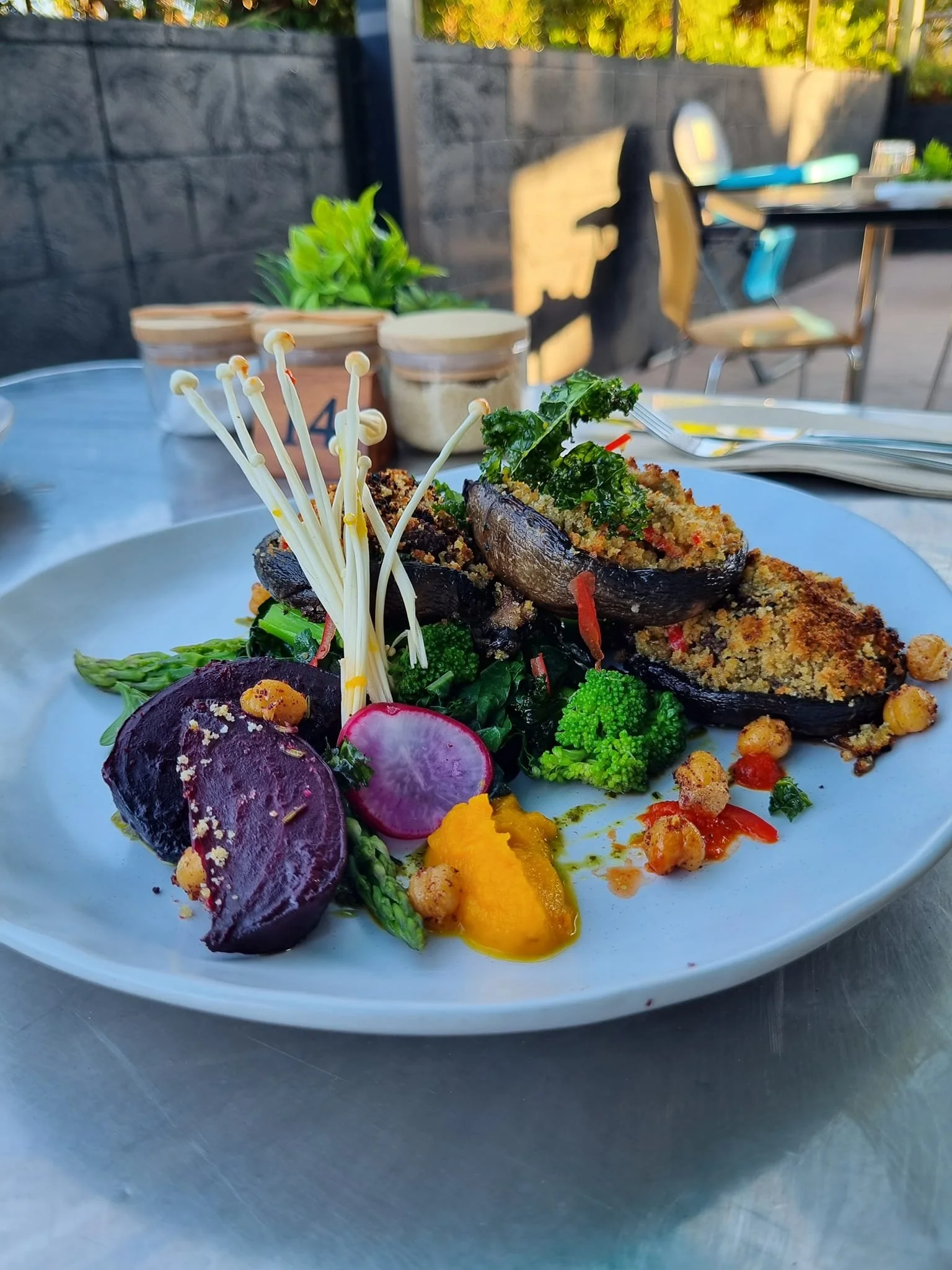

Kai’s Cafe + Restaurant
Branding
A new family owned hospitality venue required branding and collateral items that paralelled the quality of food and service they provide.
As a venue that caters to everything from takeaway pies to à la carte dinners, they needed branding and collateral to appeal to a diverse target market, and was as cheap and easy as possible to reproduce across advertising applications.
The Cottage Restaurant + Bar
Branding
A new restaurant and conference event host services the general community as well as the clientele of the semi-attached hotel next door.
Serving mediterranean inspired food, they needed a fresh look for the launch of the new restaurant that would set them apart from the neighbouring hotel and appeal to business professionals looking to dine in a relaxed atmosphere.


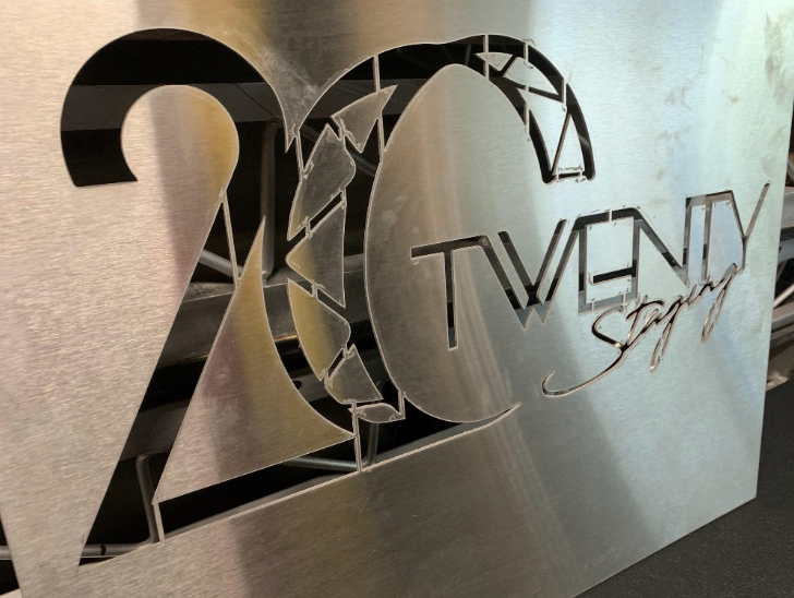


20 Twenty Staging
Branding
A mid-covid startup specialising in set design and lighting took their weakened competitors by storm upon lockdown lift and are now a thriving Sydney-based business.
20Twenty required a masculine and theatrical look whilst maintaining a sense of professionalism and needed their logo to be easily reproduced for signage, embroidery, car wraps and steel cutouts.
Vivid Thinking
Logo Update
Ingrid Rothe of Vivid Thinking knows that the quality of her logo is of paramount importance in order to communicate the attention to detail and exceptional results she provides in her marketing work.
She was irritated by her existing logo, the ‘i’’s were too fat, the ‘k’ was weirdly short and didn’t align with the ‘V’ above it, and the ‘g’ was too skinny.
She employed Ashleigh Rote Designs for a logo that was fresh, symmetrical to the eye, and subtly hinted at her work in marketing.
This idea elegantly mimics an old fashioned swing sign, and underwent several minor font tweaks to achieve alignment between the word “VIVID” and the word “thinking”


7R Horsemanship - Logo Design
Held in the heart of the New England high country and on the Northern NSW Coast, Royce Dando 7R Horsemanship’s small group, hands-on horsemanship clinics are for riders keen to gain an understanding of how to connect with and gain the trust of their horse.
This logo was a partnered project with Vivid Thinking developing brand strategy and Ashleigh Rote Designs developing the colour palette and logo design.
Health on Rusden - Logo Design
Health on Rusden (formerly Rusden Street Medical) was required a rebrand to make their practice scaleable.
This logo was a partnered project with Vivid Thinking developing brand strategy and Ashleigh Rote Designs developing the colour palette and logo design.


Rabig Bulk Haulage
When RBH was acquired by new owners, they realised their logo files were flat images that could not be used at a large scale or over a background. They did not want to change the look and feel of the brand at all since it was widely recognised and respected in the industry.
RBH employed me to fix their flat logo and provide more usable file types, as well as coming up with some complimentary colours for the brand.
They then realised that the contractual templates they had were poorly laid out visually cluttered - so they asked me to update their microsoft word templates to improve the look and feel of their client communications.


New England ┃ Hydraulics + Diesel
When New England Hydraulics & Diesel were looking at taking their fast growing business to the next level - they found that there was a whole suite of issues they hoped to resolve.
Their advertising was being overlooked, their premises was difficult to recognise and navigate, the quality and diversity of their offerings was not being publicised, most of their own staff didn’t even understand what their previous logo was depicting, plus it was difficult to print and didn’t stand out.
The business had come a really long way from what the previous owner had built - it’s now run by a passionate and dedicated team who are full of energy and expertise, and they needed a look to match that.
Perfecting the logo design, set the stage for an exciting roll-out of signage, uniforms, car wraps, advertising and online presence that has their customers engaged and team feeling proud.
ZORG ┃ Medical Products
When an existing medical distribution company spotted a gap in the market - a new brand was born and they began to take control of the manufacture their own line of medical products.
ZORG needed a logo that would be adaptable, would print well onto small packaging, stand out in the market and use a colour palette that wasn’t going to cause any issues in application.


Testimonial
Just wanted to congratulate you on the work you did for LFA First Response.
Really great outcome. Well done. I’ve finished uploading it to the website.
LAURENCE NUSSBAUMER I CEO I MONFIA CONNECT WEB DESIGN


Testimonial
This will be the easiest approval process ever.
Love the changes! You’re amazing.
DAVID LEVINGSTON | GLOBAL MARKETING MANAGER I AERO HEALTHCARE